(My photo links in my first attempt at this post failed, so re-posting with photos this time...)
This is an article that I wrote that appeared in last week's newsletter from A Walk Down Memory Lane. Just go HERE to subscribe to these fabulous weekly newsletters!
This is an article that I wrote that appeared in last week's newsletter from A Walk Down Memory Lane. Just go HERE to subscribe to these fabulous weekly newsletters!
Whenever I'm asked to describe my scrapping style, I usually respond with "Clean & Simply Detailed." Often my layouts have a very clean and simple look to them, but upon further inspection actually have a lot of detail to them. I want to share some of the techniwues that I like to use with you and how they impact the overall look of my layout.
First of all, here's the layout:
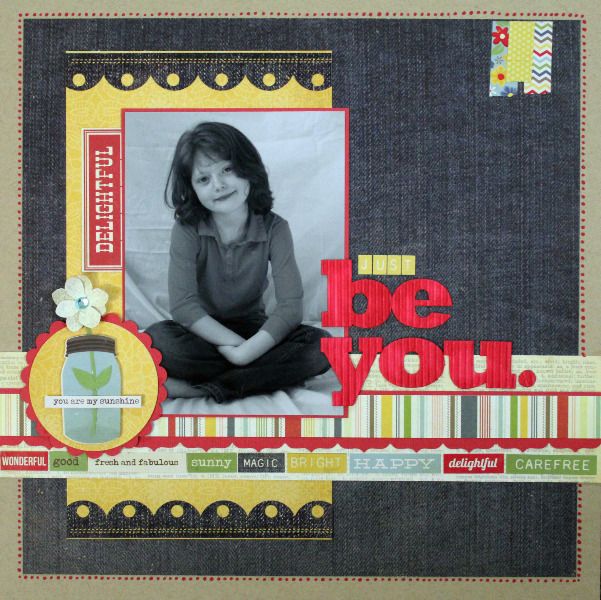
It looks pretty simple, but there's actually quite a bit going on here....
Grounding: One technique that I used throughout the layout is somethng called grounding. One way to think of grounding is that every element on the page, from the photo to the title to the journaling is always touching something else. Every element is linked in some way and nothing is just left "floating. Just a few ways that I used grounding here are:
- The photo comes into contact with the background paper, the patterned paper strips, the title and the flower element.
- The title is touching the photo and the paper strips.
- The small "tape" embellishment in the upper right hand corner is grounded to the edge of the paper.
- Tucking the word "JUST" into the negative space of the "b" for the title helps to connect the small word to the larger word without them actually touching.

Focus: As a scrapper, you have to decide what you want the person looking at your work to see first. I love this photo of my daughter, so I wanted the eye to be drawn to it. By grounding the the photo with so many elements, it keeps the eye focused on the photo. I always find that putting a mat on my photo in a coordinating color helps to draw the eye, as well. Also, little things like having the scallops on the border sticker pointing toward the photo help, too.
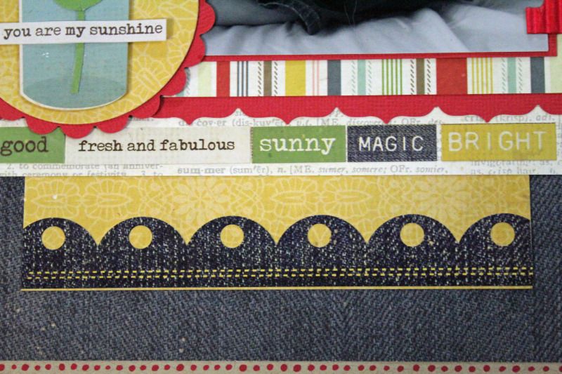
Journaling: I hate to journal. Hate it. Most of my layouts consist of journaling that includes the basics about the photo or event. I often use song lyrics or poems. Here, though I used the word stickers included with the paper collection to make a line of words that describe my daughter.
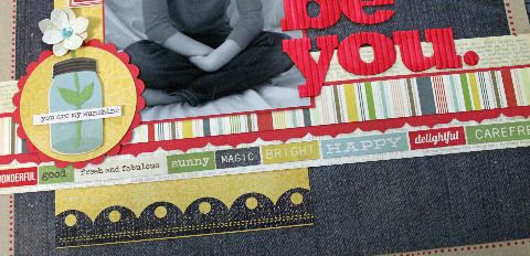
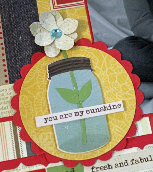
Dimension: There are several things on the page that give dimension, or at least the illusion of dimension. One thing I did was to mat my photo. Adding a mat to a photo using a contrasting, but coordinating color helps to not only bring the eye to the photo, but it helps to "pop" it off the page. I also used a corrugated alpha for my title that adds texture and dimension. The small flower element has quite a bit of dimension. I punched two small flowers and used a petal roller to cause the petals to curl up. Then, I added foam tape to the back of the "jar" as well as the flower to raise them off the page. I also cut a "stem" for the flower and made a cut in it to give the illusion that it is coming out of the jar. Adding a sticker over the jar with words on it creates just one more layer of "pop."
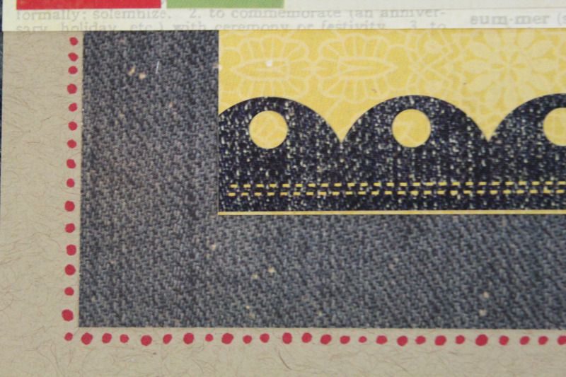
Color: There's lots to say about color, but here I just want to point out how I color to bring the page accents together. Many of the small details such as the photo mat, the scallop on the flower accent, the main title letters and the dots around the page are all the same color. I used a copic marker to color the letters and to create the dots around the page (to give the illusion of a mat). I find that using the same (or coordinating colors) for this helps to tie the elements of the page together
These are just some of the techniques that I use on a regular basis to create the look I'm going for. Another favorite is the "visual triangle" and I'll be sharing more about that in an upcoming blogpost.
I hope you enjoyed this little peek into how my mind works and how my layouts come together!
You can find all of the products used on this layout at A Walk Down Memory Lane!
Thanks so much for stopping by today! Come back soon!