Wednesday, July 31, 2013

Perpetual Birthday Calendar!

Hey, everyone!  Here's a fun post that was shared on the AWDML blog last week!

This week, I have birthdays on the brain! I always feel like I'm going to forget someone (and often do...), so I wanted to have something that would be a quick reference to know when everyone's birthday is. I created a perpetual birthday calendar. You can use it year after year and just add people as you go!

I started with a 5"x7" acrylic free standing frame that you can get from any department or craft store. I batted my big brown eyes and got my husband to drill two holes in it. Each hole is 1" from the outer edge and 1/2" from the top.


Then I created my cover. I wanted it to be festive and fun, but something I could keep out on my desk year round. I found this great cherry paper in the Echo Park Perfect Summer collection and then used up some of my Thicker stash for the letters. I punched the cover 1" from the outer edge and 1/2" from the top to match the acrylic frame.


Next, I created the pages that I fill in the birthdays on. They are simple, yet functional. Just print, punch and go! I created mine using Word and saved it as a PDF file. You are more than welcome to download it HERE.


I connected all of the pages using book rings and I'm ready to start filling in the birthdays of all my friends and family! I'll never miss another birthday! Here it is all put together, ready to sit on your desk or mantle all year!


Now, simply flip the over over to any month you need and see who has a birthday that month!


I hope you enjoyed today's project and that you're inspired to make one of your own! 

Thanks so much for stopping by today and be sure to check out AWDML for all of the latest in scrapping goodies and all of the supplies used to make this project!

Sunday, July 28, 2013

Altered Cans Project

I'm working on getting caught up on all of the blog posts that I haven't shared this month.  Even though this is a 4th of July project, this could be made for any party or event-- just change up the paper you use!

Today I’m sharing a fun project that would be perfect for your 4th of July picnic table, but can be changed to suit any occasion!
 
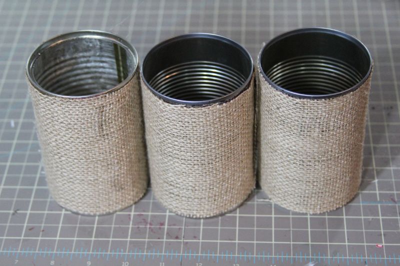
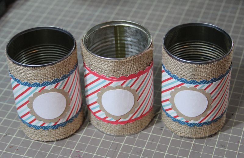
I started with three cans from the recycle bin. I think these are actually two cans of refried beans and some mandarin oranges! Then, I covered them in burlap fabric. These cans measured 4″ tall and 9 1/4″ around. I tried a few different adhesives, but I found that hot glue worked the best for me.


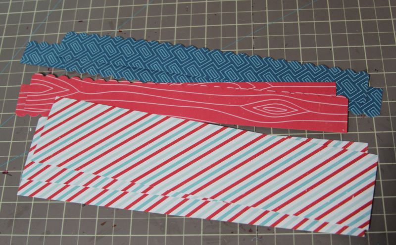
Now, I cut three strips of paper that were 2 1/4″ by 10″ and punched three smaller strips that were also 10″ long.


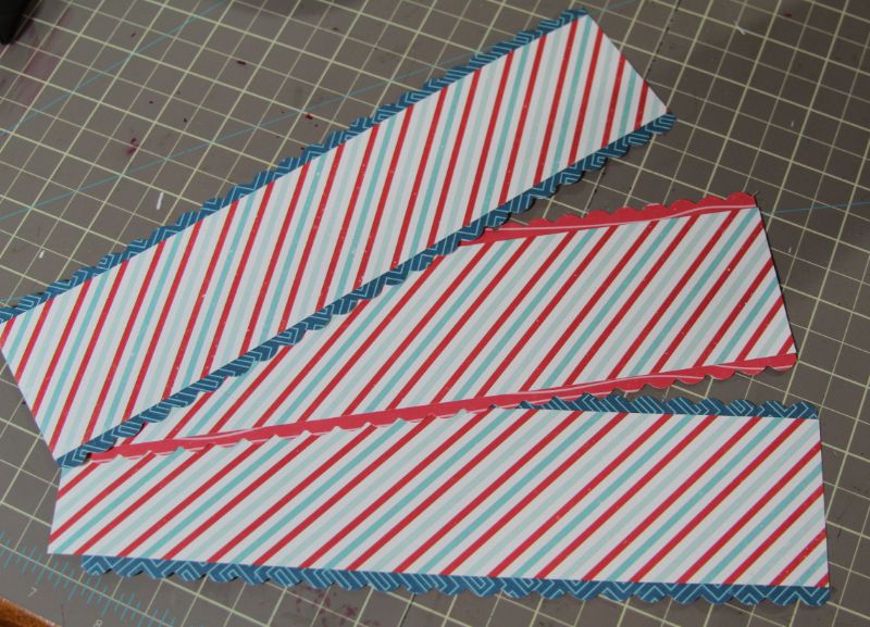
Next, using my ATG gun, I attached my punch strips to the back of the 2 1/4″ strips, like so:


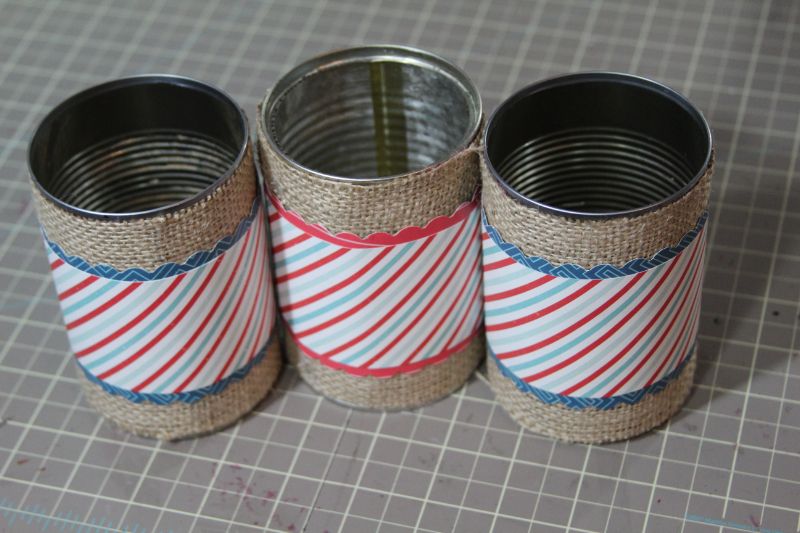
Now, using the hot glue gun, I adhered these strips to my cans.


Next, I punched three scalloped circles from kraft paper and three circles from white cardstock. I glued each white circle onto a scalloped circle and then adhered them to the cans.

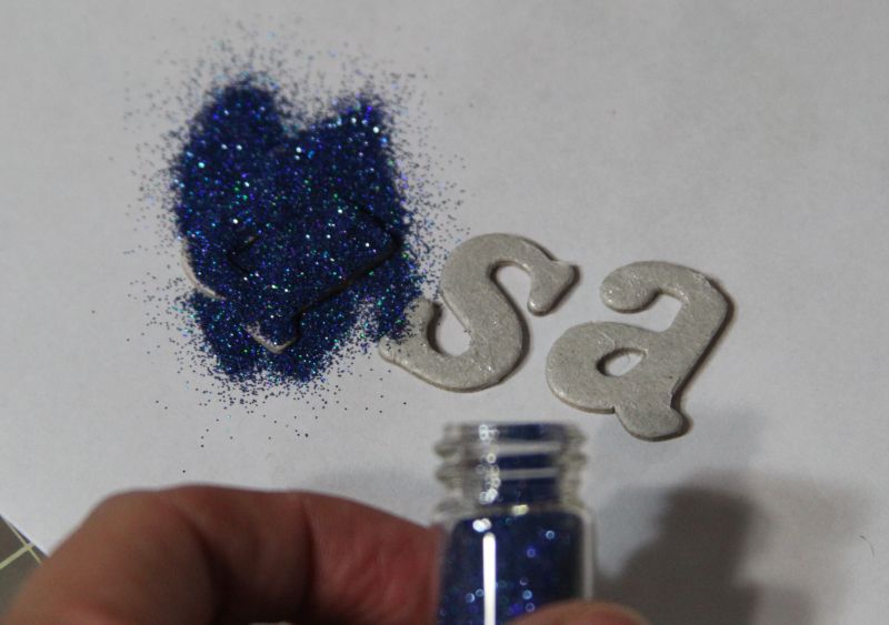
Now, to add some sparkle, I decided to glitter some chipboard pieces. To do this, I ran my chipboard letters through my Xyron FACE DOWN so that the glue is on the FRONT of the letter.

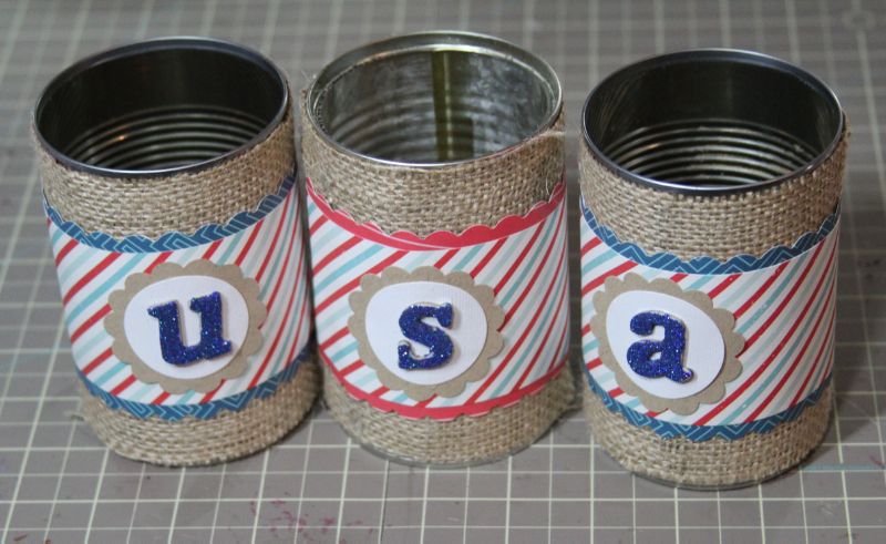
Next, I used my finger to press gently on the glitter to make sure it stuck and then picked up each letter and shook off the excess glitter. I usually tap it gently on the table to get all of the loose glitter off, as well. Then, I glued the letters on the front of the cans.

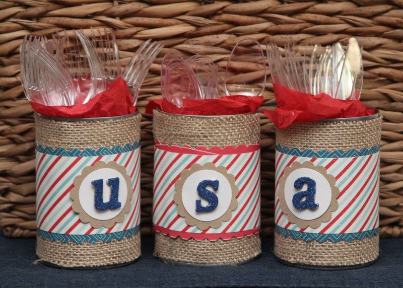
Finally I added some coordinating tissue paper and put in the plastic silverware that we’ll use at our 4th of July picnic. You could also add decorated pretzel sticks, pinwheels, lolipops, or anything that fits the occasion you are celebrating!
I hope you enjoyed today’s project and that you’ll consider trying this for your next party!


Friday, July 26, 2013

You & Me: Confessions of a Mat-a-holic

Here's an article I wrote for the latest edition of the A Walk Down Memory Lane newsletter!  You can subscribere HERE to receive weekly newsletters chock full of tutorials, product and manufacturer features, inspiration and of course, the weekly sale!
 
Hello. My name is Nicole and I am a matting addict. I love to mat everything and I'm admitting it! The good news is that this is NOT a problem I need to stop! It's not bad for my health and (in my opinion) it's GREAT for my layouts!

 I have created a rather simple layout today to illustrate my point. First, here's the basic layout where I did not mat the major parts of my layout (the layers of patterned paper, the journaling and my photo). Please excuse that things are a little crooked here... nothing is glued down. I realy feel that the layout looks washed out and that it needs some POP!

 
One of my favorite ways to make the different elements of my page POP is to add mats! Lots of people mat their photos... but I like to mat EVERYTHING! Here's my layout again with the major elements matted.  Everything just feels more focused to me!
See how your attention is drawn to each element, but doesn't take away from the photo? You may notice that i also colored the title-- I love to color the corrugated alphas with my copics! I also ditched the banner pieces from the first draft of my layout and added the little clothesline sticker. I also added some other elements, most of which are popped up with foam tape to add dimension-- another great way to add some POP to your projects!
 
**Note- I achieved the matching color for the alphas by first coloring with the BG45 and then coloring over it with the B93. Combining Copic colors (do the darker color first) is a great way to customize your colors for any project you're working on!

So try catching the matting fever and see were it takes you! Do you like to use journaling strips? Try matting those and see what you think! Nearly any page element can be matted for a little extra pop! Try it-- you'll like it!

Products Used:
Patterned Paper and Stickers: Echo Park Perfect Summer Collection
Cardstock: Bazzil
Adhesive: ATG Gun and Scotch Quick Dry
 

Thanks so much for stopping by my blog today!  I hope you come again soon!
 

Wednesday, July 24, 2013

BIG FISH!!


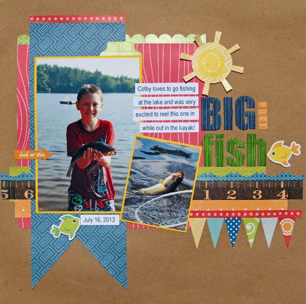
Hey there, everyone!!  I hope everyone is having a fantastic summer! We’ve been super busy and on the go for the last few weeks, but this week we are slowing things down and trying to enjoy some of the fun things that can only be done in ths summer… like time at the LAKE! We have some tremendous friends who open their home (and their dock) to us every summer to enjoy any time we want to. We are so grateful and enjoy every minute we are there!

Last week, Colby decided to try fishing from the kayak. He was happily fishing in the “weeds” when he yelled, “I GOT ONE!” Of couse, the fish swallowed his lure, so he couldn’t get it off to release it and had to tow the fish back to the dock for help. When he pulled up to the dock, I saw that he had a great, big bass on his line! He was all smiles, of course!

I was excited to use the Echo Park Perfect Summer collection to scrap these fun photos and this great memory!


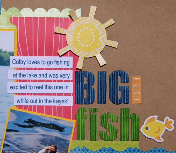
One of my favorite things to do while creating my title is to use my Copic Markers to color stickers, chipboard and alphas to match what I’m working on. Here, I used the Jillibean Soup Corrugated Alphas and colored them to perfectly match. Now, I can just get white alphas and then make them match- I never have to worry about not having the right color!


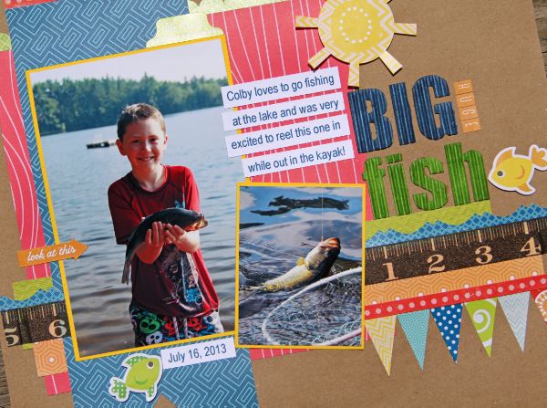
Here’s a close-up of the layout where you can see the fun details added with the fabulous stickers included in the Perfect Summer Collection. I love to pop them up with foam tape to add dimension and used the fishies and the sun sticker to create my visual triangle. I also added some fun Washi tape that looks like a ruler to highlight how “big” the fish is!


I hope you enjoyed my layout today and that you’re inspired to dive right into your scrappy stash!  Thanks so much for stopping by!

Monday, July 1, 2013

It's July...

It's July and that means it's time to share a new sketch from the wonderfully talented Lucy Chesna of My Sketch World!  This month brings a great sketch and I had some fun playing with some brand new Echo Park goodies, too!

Here's my take on it:

Here's a close up of the photo and the title work.  This title incorporates two things I love to do:  mixing my alphas and running the title onto a photo.  I just love the effect!

Here's the sketch that this layout is based on.  You can see that I focused on the four strips and incorporated the journaling strips, the large flower and the title placement.  One of the things I love about using sketches is how you can pick and choose what inspires you and make it your own. Lucy's sketches are particularly perfect for that!
You can go HERE to see what the rest of the team did with the sketch!  There are some fantastic layouts there!  Way to go, ladies!!
Thanks for stopping by today!  I'll be back soon with more good stuff to share!